Asda has received criticism from customers for “embarrassing poorer families” with their recently rebranded Just Essentials range. But is their latest move a rebrand disaster or is it a smart move?
Strategic decision-making
Of all the UK grocers, Asda own the largest share of the value market with a range spanning more than 300 product lines, from fresh meats and poultry to household basics – they’ve got it all covered.
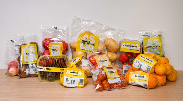
In their continued drive to help families combat the cost-of-living crisis Asda have further extended their value range and as part of this extension rebranded from ‘Smart Price’ to ‘Just Essentials’.
A strategic, commercial decision by the retailer was to use a vibrant colour to “help customers find products easily in-store and online” and the new design style also adds “warmth and soul” to their low-budget own label range.
They certainly fulfilled the creative brief as their bright yellow packaging packs a punch on-shelf – you really can’t miss it!

Customer feedback
Many shoppers have welcomed the ‘cheaper than cheap’ product range, however, Asda’s latest move hasn’t been so well received by everyone and the supermarket giant has come under fire for their rebranding colour choice.
Some feel the Just Essentials range acts as a ‘poverty marker’ and draws attention to those choosing to buy the cheaper products which could cause embarrassment to them.
People have taken to social media to express their views: “…it is the most ridiculous bright yellow packaging which just screams “WE ARE POOR” for any shopper buying them”. Another said: “It screams ‘inferior product’, and that people on a lower income don’t deserve nice designs”.
In response, an Asda spokesperson told Grocery Gazette that they “don’t understand why anyone would feel embarrassed for saving money”. That may well be the case, but for some, they don’t want to make it so obvious of their need to shop on a low budget.
Personal opinion
Personally, my view is that it’s a bold, brave move by Asda. The new packaging has revolutionised their value range and has proven that value packaging doesn’t have to be white, soulless, or boring!
The brief was to stand out on-shelf and online and they’ve done that well but hopefully not to the detriment of turning off customers!
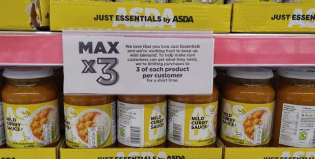
Although interestingly, Asda have temporarily placed a limit on the number of Just Essentials items a customer can purchase to help alleviate supply challenges. And people have been quick to take to social media to slam Asda and express their frustrations and anger about not being able to buy the quantity they need. Which raises the question whether people were really that embarrassed by the “poverty marker” packaging after all!
Whatever your subjective view of their rebrand, Asda and their creative agency turned the entire project around in six months! That’s concept through to 300 lines on the shelf – a monumental feat which must’ve required some pretty impressive teamwork and project management skills. Bravo to both!