
How did we help?
Brand strategy
Logo design
Own label development
Goal
To showcase the brand’s passion and knowledge of woodworking.
Client: Axminster Tools
Owning a strong purpose and passion.
We worked with Axminster Tools &Machinery to help define their purpose. It was apparent from the outset that nobody is more passionate or knowledgeable about woodworking then they are! We wanted to elevate their passion for what they do to become physically, visually and emotionally integral to their identity.

Evolution or revolution?
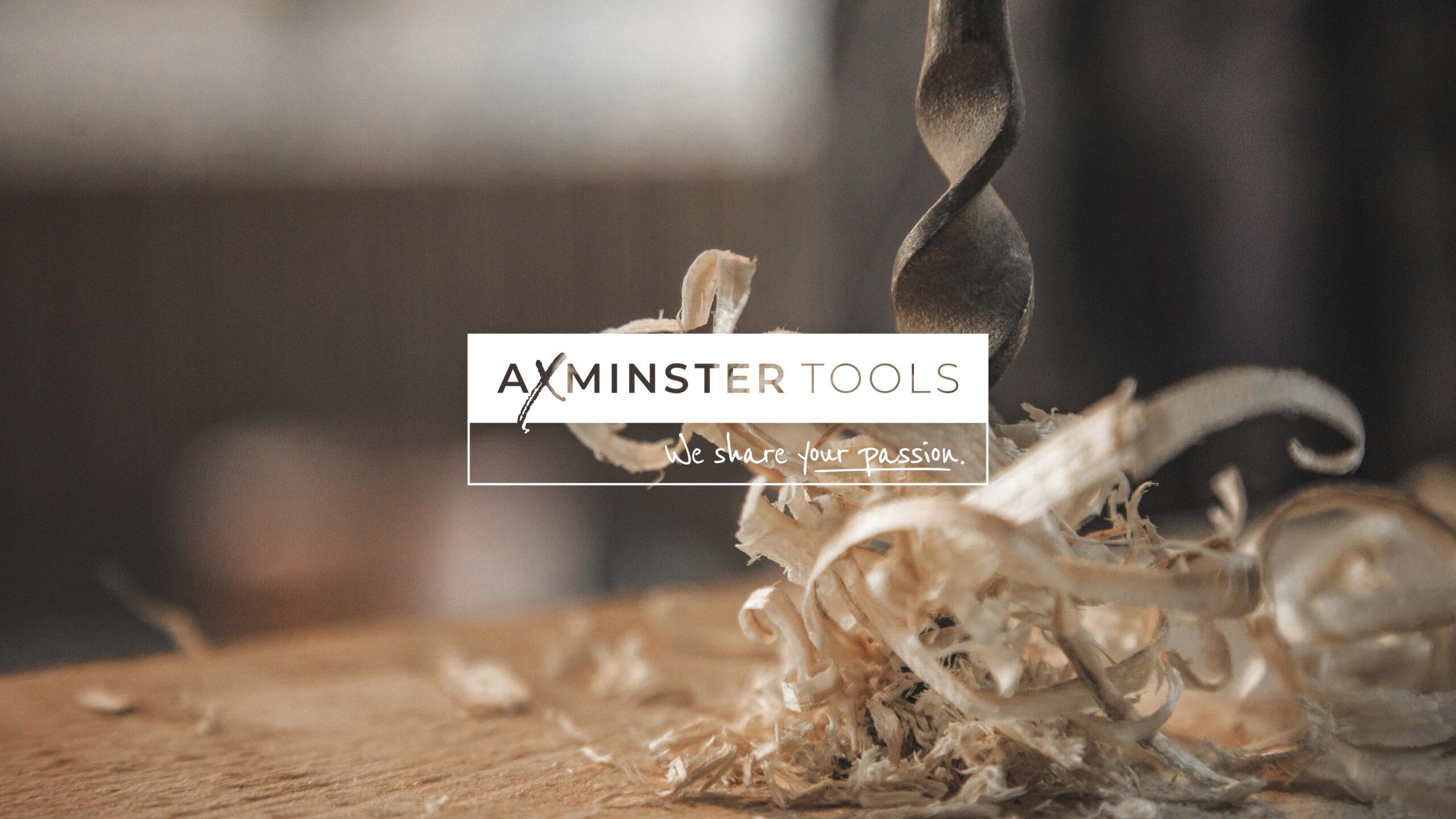
The Axminster Tools & Machinery brand has built a strong reputation over the last 50 years so it was important to capitalise on this equity. Therefore, the new logo needed to be an evolution of the existing as opposed to undertaking a revolutionary approach.

Subtle changes, big impact.
Through market research we learnt that customers generally refer to the brand as Axminster Tools, as opposed to Axminster Tools & Machinery so we simplified the name to reflect this. The name now sits on the same line to highlight their full name, and uses both a bold and light font to create a distinction between the two words.
The ‘X’ symbolises a woodworker’s cross and is relevant to what the brand’s audience do, whilst giving the brand more distinction and memorability.
We also made subtle changes to the colours to modernise the logo, black became a dark grey and the red more vibrant – both help to freshen the logo.
Finally, the strapline “We share your passion” is now embedded into the logo to elevate their belief in their customer’s passion and to reinforce their own purpose.

Developing brand extensions.
We worked with the client to create a clearly defined own label product brand strategy, to include a rationalisation of the entire product range to provide clarity to both customers and staff.
We created a top tier product brand structure which focussed solely on customer need – Axminster Woodturning, a specialist range aimed at all woodturners with a product to suit all levels of skill. Axminster Professional , an innovative, performance inspired range for professional woodworkers. And Axminster Craft, a range developed for the woodworking hobbyist.


Creating own labels.
During the restructuring process, we identified several opportunities within the client’s own brand ranges. As with any own brand there is little no reference to the parent brand.
However, with Axminster Tools we wanted people to connect the product to the people behind it to showcase their passion for woodworking and their knowledge. So own brand turned into own label to reinforce their voice of authority and build on brand equity.
UJK was well know and had a lot of credibility, so when rebranding it was important to build upon this equity by evolving the design, rather than revolutionise it.
The Axcaliber brand was refreshed and modernised, whilst retaining and building upon existing brand equity, which is why we maintained a strong connection to the old logo.
Whereas, Rider had a revolutionised approach! From research we recognised the existing logo didnât sit comfortably within the hand-crafted market and therefore required a fresh approach to highlight the range’s values and artisan product offering.

A job well done!
The rebrand of their corporate brand and product brands clearly demonstrates Axminster Tools’s specialism who share their customers passion for woodworking, craftsmanship and a job well done!
Say hello


