
How did we help?
Brand positioning
Brand logo development
Brand design style
Brand guidelines
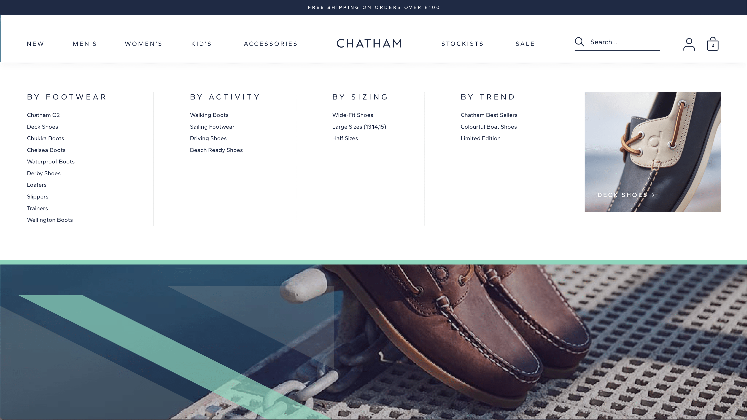
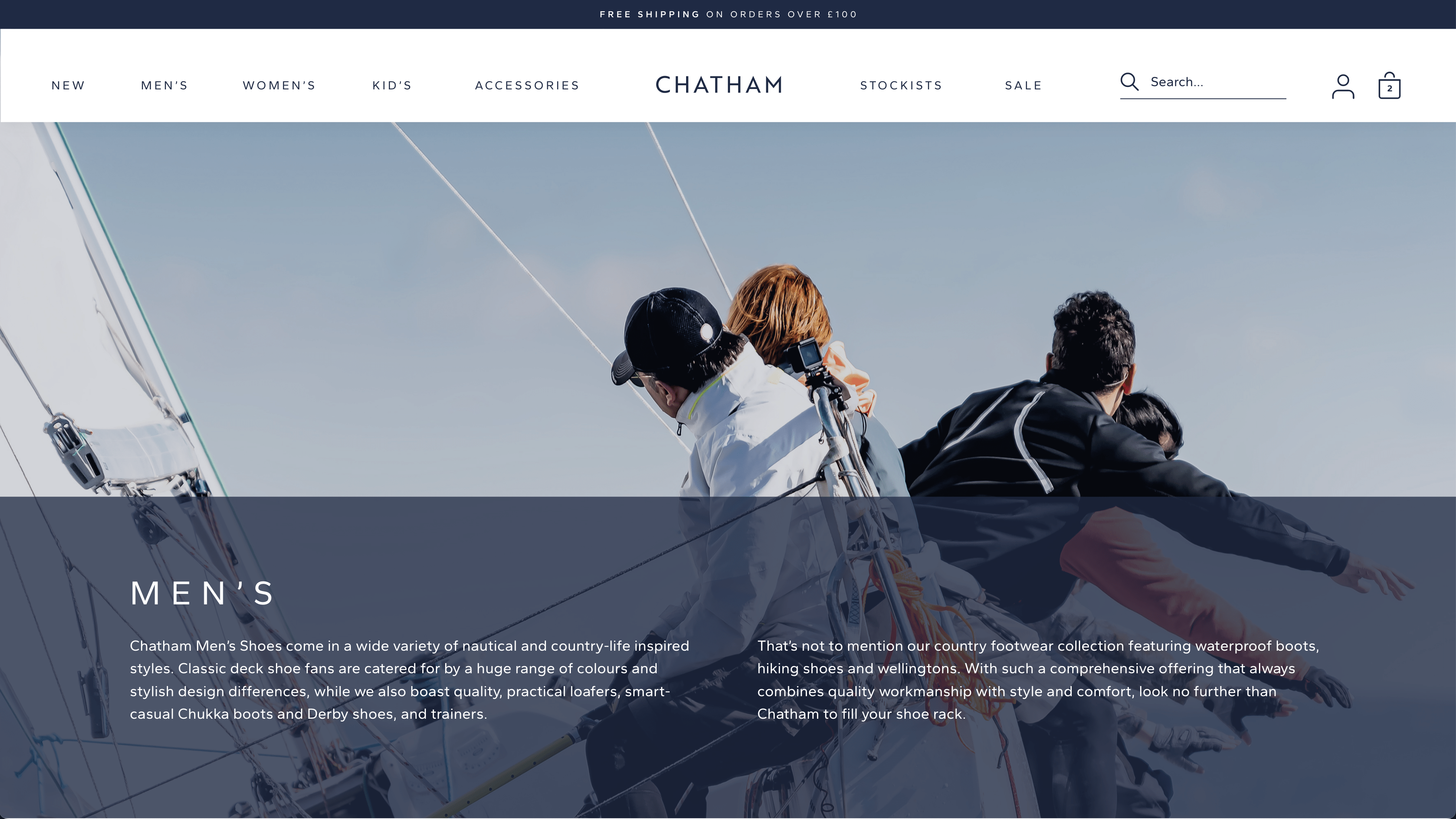
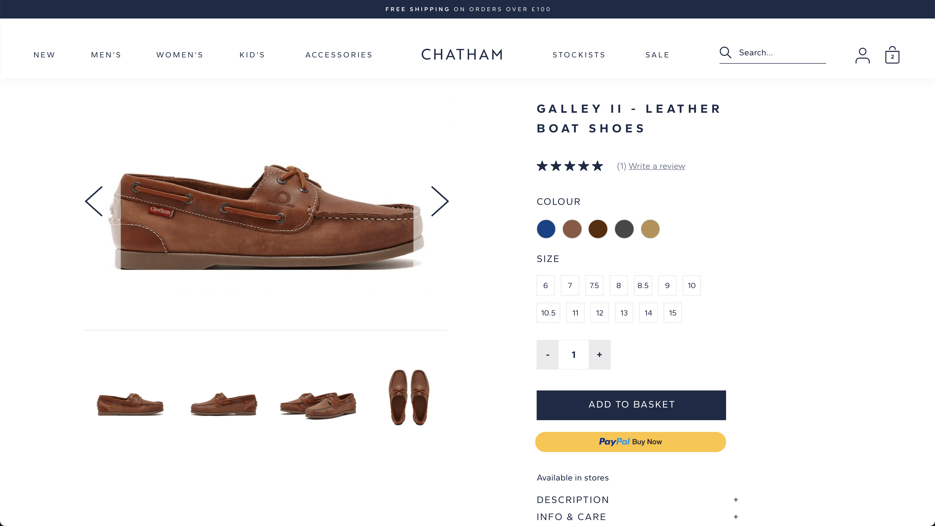
Web design
Packaging design
Collateral design
Goal
To evolve and elevate the Chatham footwear brand
Client: Marsh Footwear – Chatham
With over 30 years of shoe making expertise, Chatham is one of Britain’s key lifestyle footwear brands with a strong heritage in the marine industry.
With new audiences already developed in the equestrian and country sectors, it was important to define the positioning of the new Chatham offering and develop a brand that would bring it to life and reflect their quality product design.


Positioning the brand.
A successful brand needs to start with the strategy. Chatham shoes have had a strong heritage in the marine sector since 1989 but have steadily grown their product ranges and audiences into Equestrian and Country life so it was important to review their brand positioning and ensure they were clear on what the brand stands for in these new markets.
We held one of our proprietary Core Values workshops which helped Chatham understand their audience in more detail and what they offer them. We summarised the brand into two distinct value words which encompassed both their quality and ‘heritage’ whilst also capturing the ‘aspirational’ nature of their designs.


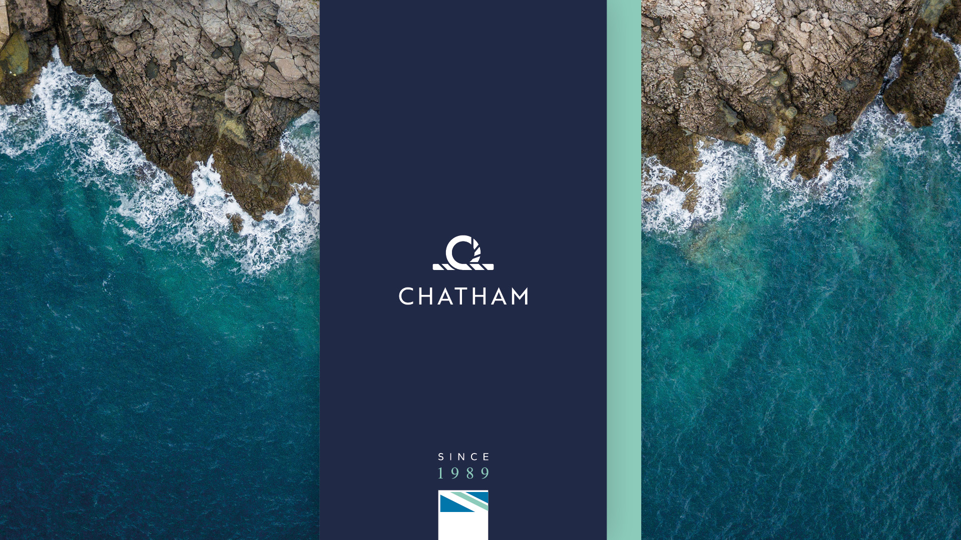
Evolving a Great British brand.
The Chatham logo comprised of a couple of different elements which still maintained quite a bit of equity – the rope graphic and the British flag. These elements were felt to be quite important to the audience and were a distinct part of the Chatham brand. Whilst we knew the flag was still key, we didn’t feel it needed to form part of the logo itself so we moved this out into the overall brand style. Our focus then moved to the rope graphic which we explored to various different degrees, along with fonts and wordmarks.
The client decided on an evolutionary logo that retained the same structure but included a much simpler rope graphic that would be easier to reproduce in different forms along with an uppercase, stronger font.

Taking the next step.
Once the logo was finalised, we needed to consider how it would all come to life across the whole brand. We developed unique graphics that included a unique take on the British flag, contour vectors which are a nod to the three different audiences and a rope graphic which is an extension of the identity. We also considered the different layers of photography, how product ranges should be displayed, the secondary colour palette and also, how their more premium G2 products could be differentiated.
With the addition of a Brand Guidelines document, the brand now has all the pieces in place to create strong consistencies of design going forward.
The end result is a visual style that elevates the positioning of the brand and is befitting of the high quality and standards of the shoes themselves.

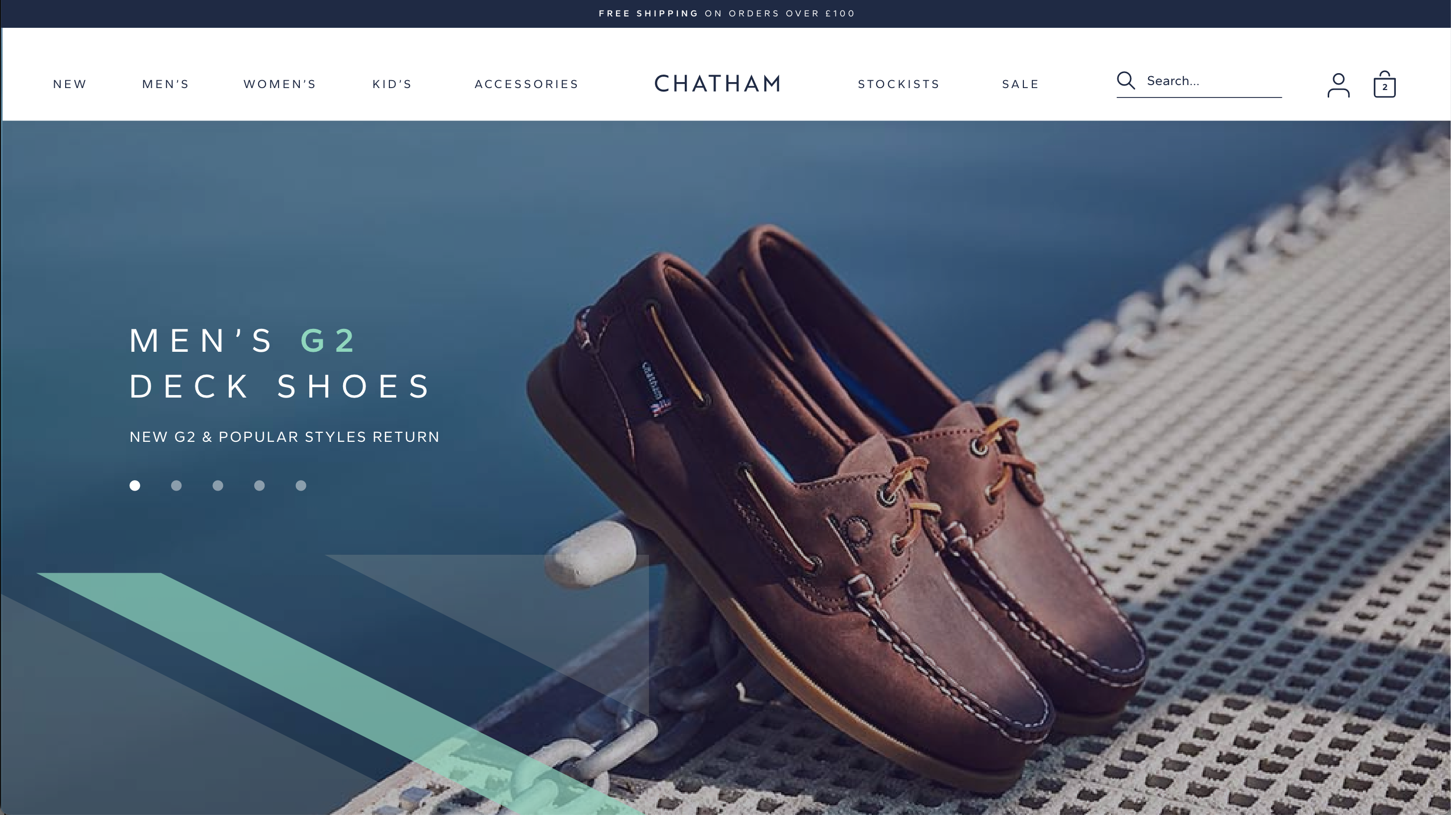
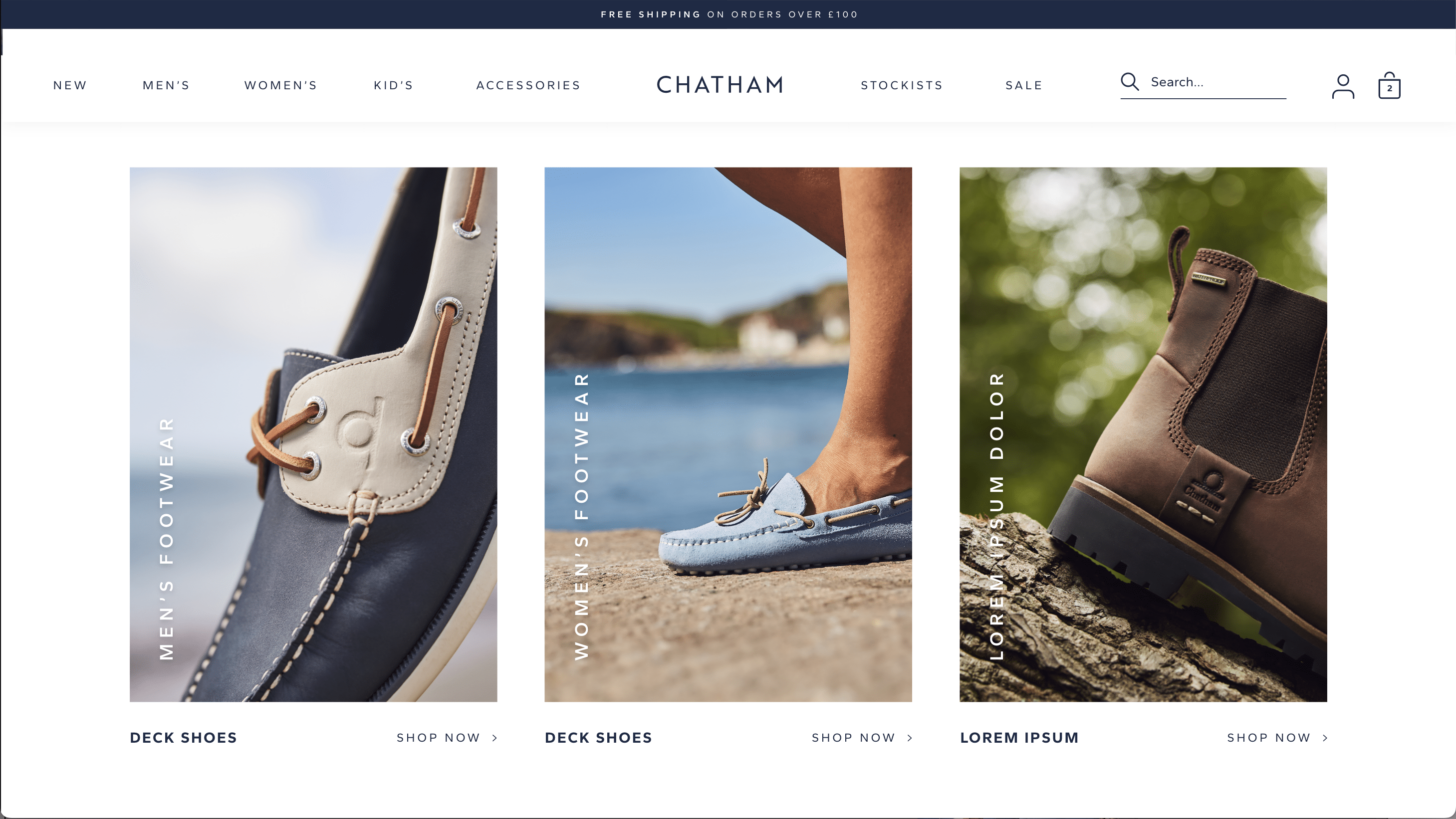
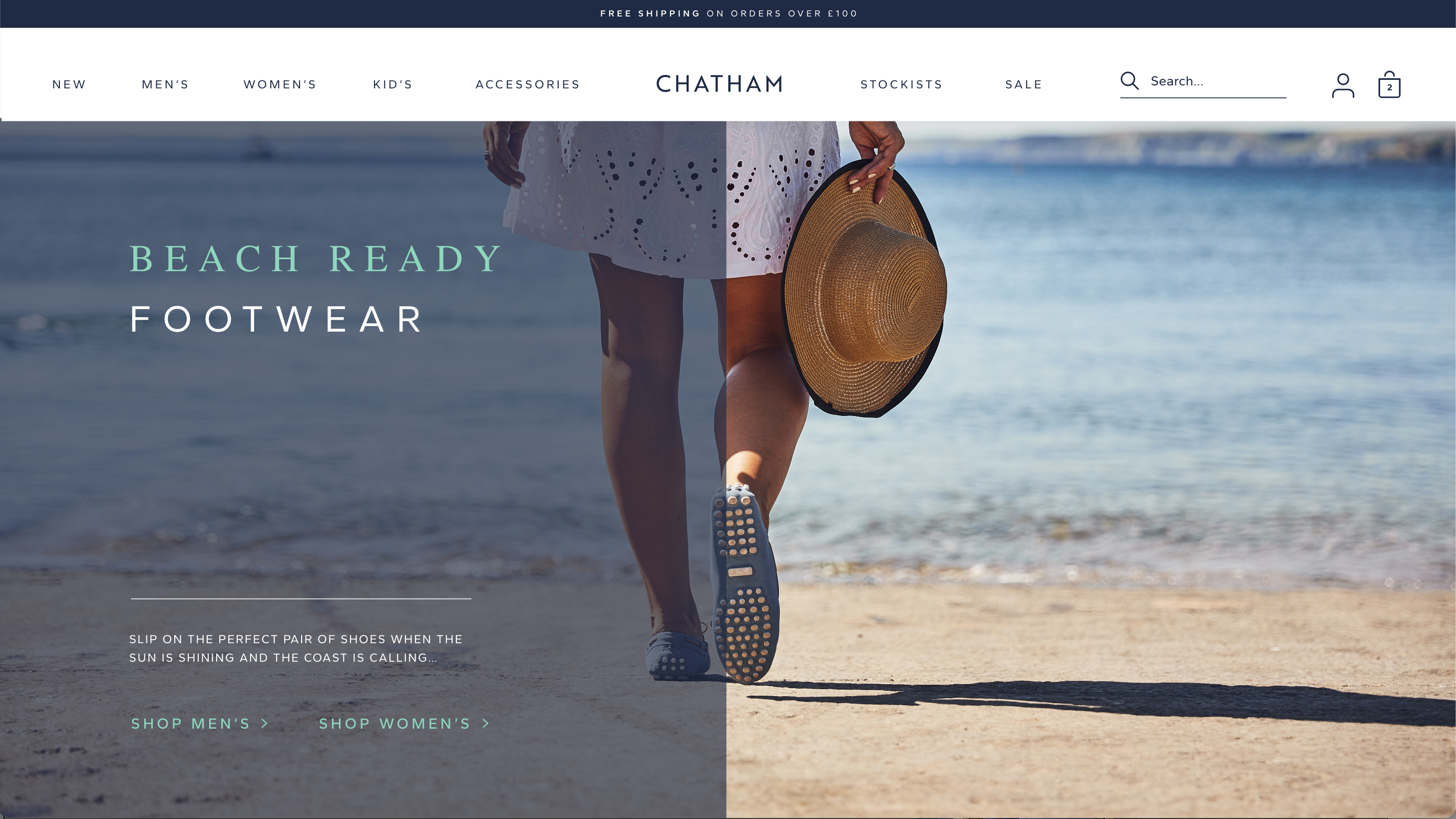
Visualising the brand online.
Whilst Chatham have a team of developers they already work with, it was important to maintain the integrity of the design throughout the site. We therefore worked with the developers to understand the restrictions of the CMS platform and then re-designed a number of existing pages to demonstrate how the design should be implemented in the website.
The designs were created in XD so once Chatham had signed them all off, the file could be provided straight to the developers and they were able to extract all the assets they needed.
The website is now a shop window that the client can be proud of – www.chatham.co.uk
Putting our stamp on the packaging.
From our experience in other packaging design, we first asked the right questions to make sure that all practical factors had been considered when we looked at the designs, for example, how the boxes were displayed in the warehouse and what additional stickers would go on them so we made sure the required space was left in the right position.
We created two different box designs with one focused on the more premium G2 product to help distinguish it. This introduced the dark blue wash that is unique for G2 and was an ingredient we had created as part of the design style stage of the project.
By following the design style and guidelines, we have been able to create consistently good designs for all their collateral, including event materials, POS and ads.

Testimonial
“Having previously worked with Chalk & Ward on various strategic and branding projects, we knew they were the right partner to evolve our much loved Chatham brand. They helped us develop our positioning and created a new logo and visual identity which gives our brand a new, more modern lease of life while still being sympathetic to the equity behind it. They then designed a number of assets to help roll out the new branding, including the website design, packaging and POS. We’re confident that our new elevated brand will put us in a strong position moving forward and would recommend Chak & Ward for the expertise they brought to the whole process.”
Philip Marsh / Joint Managing Director / Marsh Footwear


