How did we help?
Fashion market research
Brand logo
Brand design style
Brand guidelines
Packaging design
Goal
Rebranding Rainbow Club to provide more retail opportunities whilst maintaining their bridal expertise and heritage
Client: Rainbow Club
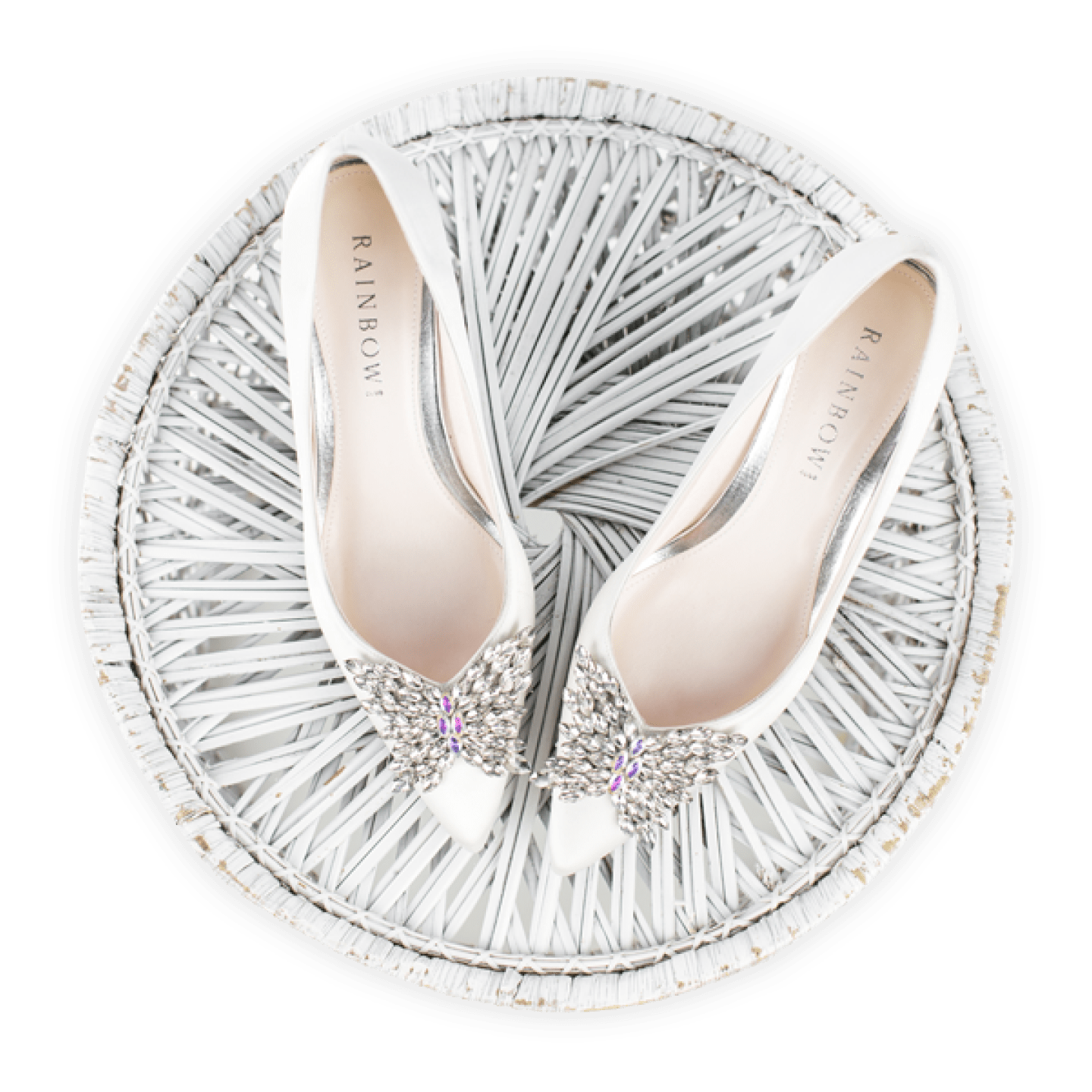
Rainbow Club is the UK market leader in bridal footwear and is known for its stylish designs.
Extremely comfortable shoes and their special touch of adding a blue stone to the sole of every shoe for that little ‘something blue’ for the bride. They offer a unique hand-colouring service, which ensures that every bride can choose a shoe – for either themselves or their bridal party – in any colour of the Rainbow to match their colour scheme and flowers.
The brief
Rainbow Club have always been rooted in the bridal market, but the future of the business lies in developing brand identity outside of that market; so our brief was to create a brand that can be positioned as a special occasion footwear brand. We wanted to create a brand that is more trendy, aspirational and premium, to fit the quality of the products and provide more avenues for distribution.
Our strategic approach
Having previously worked with Rainbow Club on developing their core values and brand positioning, our first step was to re-visit this work to ensure that any designs we created were reflective of the values, and in keeping with the brand. We challenged the client on some of the initial thoughts in the brief and discussed the strategy in detail with them to ensure that we were all on the same page.
Before we started any designs, we carried out desk research both online and instore. The client was looking to enter a much more competitive market so it was important to ensure that we understood the premium footwear market and how Rainbow Club will sit within it. Rainbow does not compete with the designer brands, as they have a more accessible price point; but for those customers who would not buy designer, they need to feel like they’re getting a high end, quality product, so the brand needs to represent that.
We explored brand architecture, fonts, logos and colour palettes, and did a series of sketches before committing to the first designs.
Designing the logo
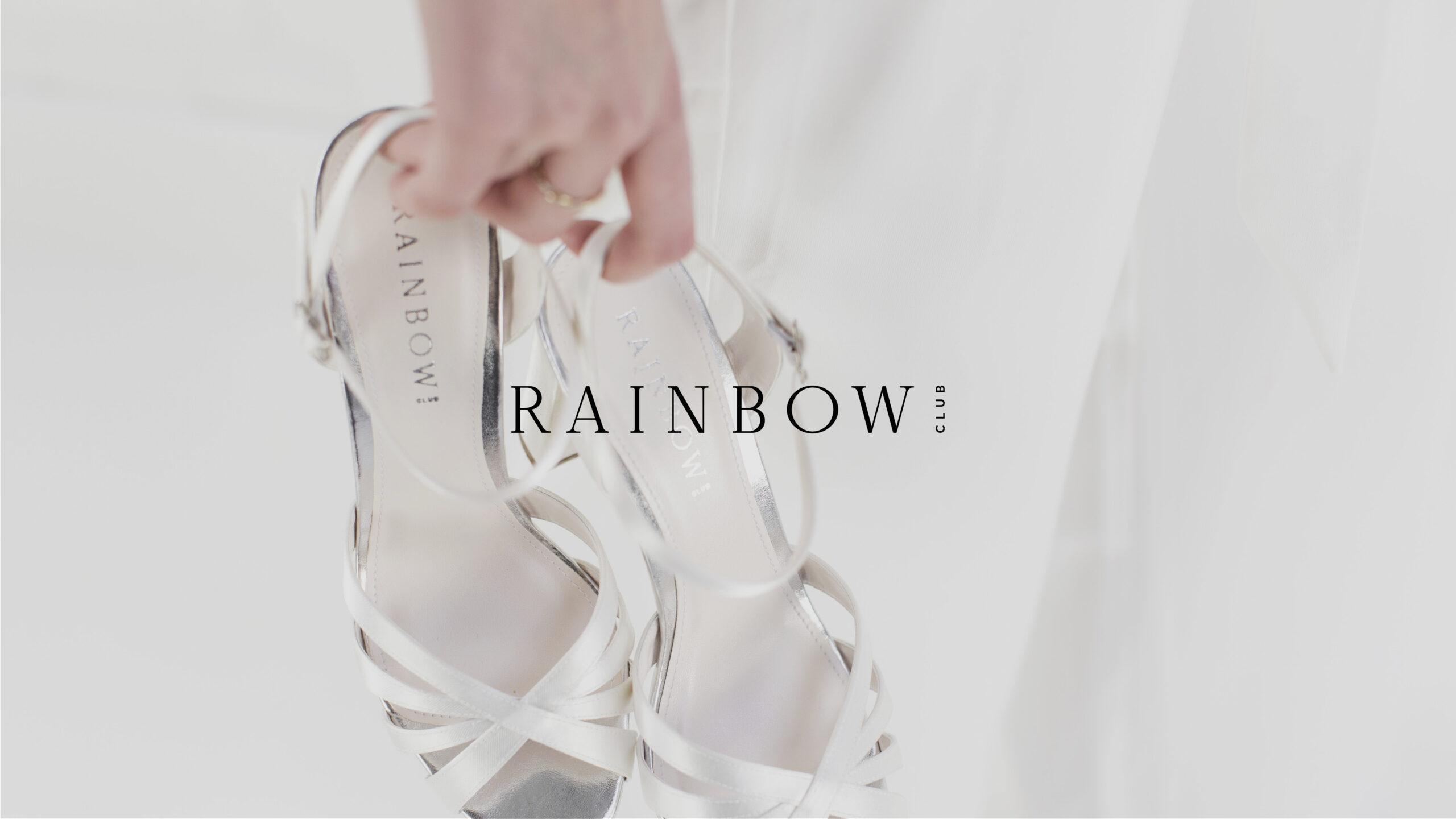
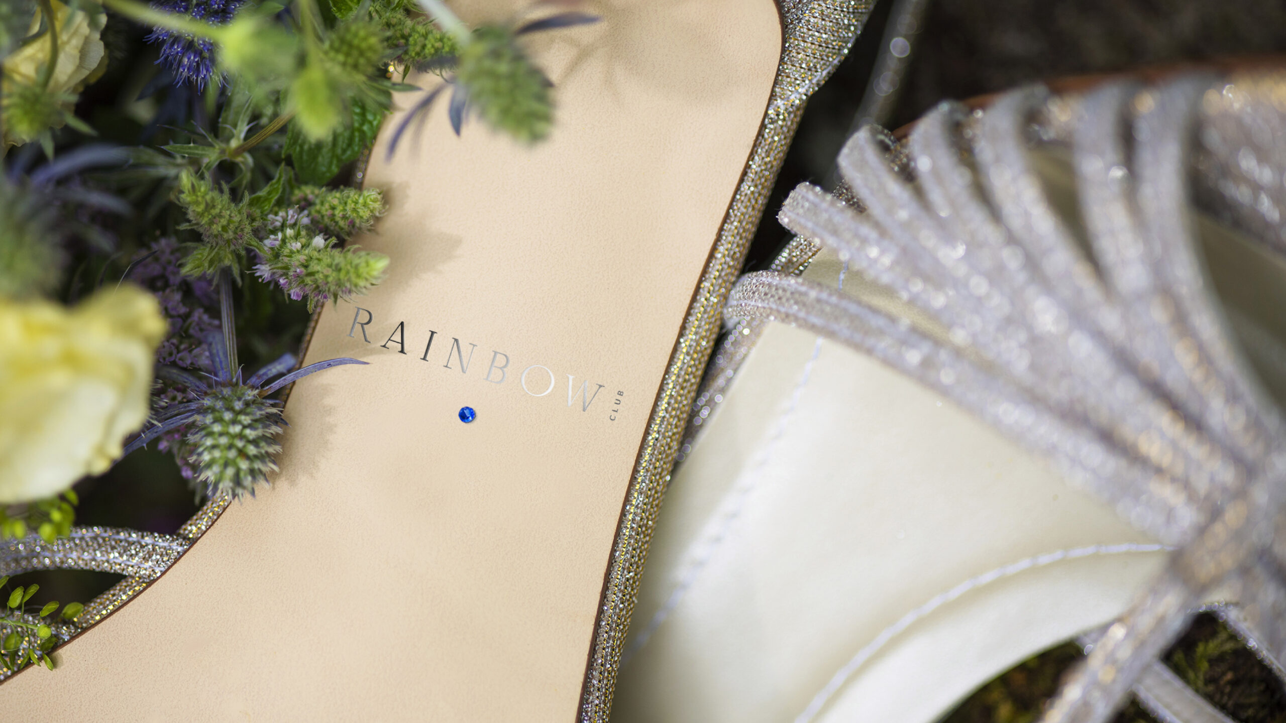
Despite staying true to the Core Values, we had quite a bit of flexibility when creating the brand identity, as the client was brave and open to change. We provided a range of options to choose from – which represented different possible routes we could take – and for each of our top choices, we demonstrated how the logo would work as a social graphic/handle and on the sole of the product with the blue stone.
The final logo was chosen, which fulfills the brief exactly and positions Rainbow Club as a trendy, aspirational footwear brand. Black and White are key to this logo, so that it stays on trend and allows us to introduce new seasonal colours as and when required.
Creating a visual brand
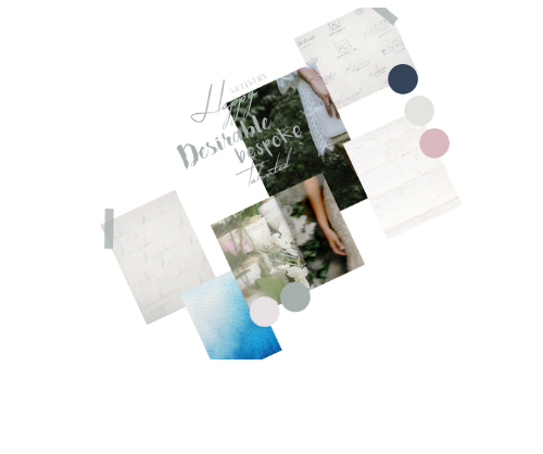
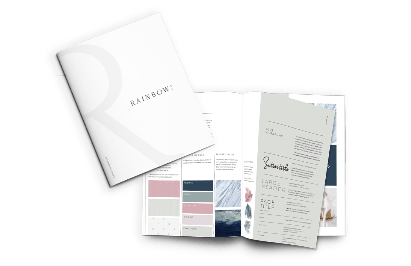
A logo is only one part of how a brand is brought to life. Following the logo decision, we created a design style that considered all other aspects for how the brand should be visualised, including:
Additional logos, e.g. for use with metallic and on the shoe itself
The rules of logo use
Fonts and font hierarchy
Secondary colour palette
Graphic devices
Imagery
Style and tone
These guidelines will now form the basis for all the design going forward, so that consistency is created across all collateral and the brand becomes more impactful.
Packaging to fit the brand
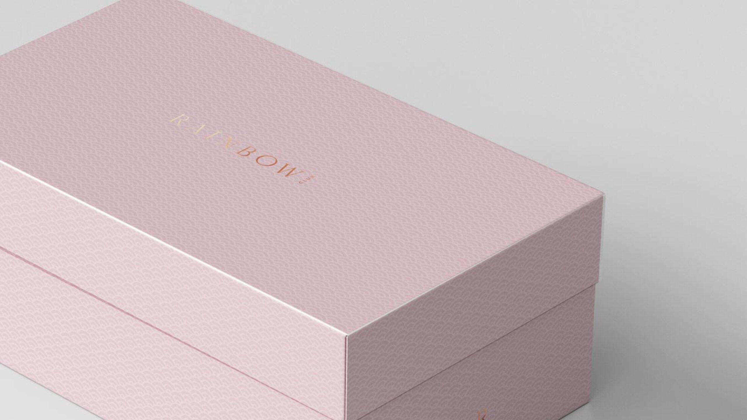
We also developed the new packaging for the brand, which is a vital part of the customer experience when they buy the shoes. We wanted the customer to fall in love with the shoes all over again when they open the box, so we explored different colour options, the use of metallics and embossing, and also the tissue paper graphic.
It was important to ensure that any changes were within budget, so we worked closely with the client as they got various samples made and tested different approaches. The final packaging is a huge step on from where they were and will help make an impact on the shelves at John Lewis and their other retailers.
Rainbow Club now has a logo and visual identity that helps elevate it to a more aspirational brand and gives it the opportunities it needs to maximise its potential in the market.
Testimonial
“Having previously worked with Chalk & Ward on our brand positioning, they were the perfect partner to take our visual brand identity to the next level, both strategically and creatively. Our new logo and design style are exactly what we wanted and have been received very positively by all our stakeholders and customers. We’re excited about the contribution it will make to how we are perceived in the market and most importantly, to our sales line.”
Richard Marsh / MD / Rainbow Club
